


Background
For the last few years, one of the hottest topics in clinical research has been data integrity. An important part of ensuring data integrity - that is now mandated by the authorities - is the structured review of audit trails. Unfortunately, there is little guidance on how to perform such review. As it is virtually impossible to read all lines in an audit trail (and it would not make much sense either), other means of review need to be applied.
The solution for this problem is visual data analytics. We have created an interactive environment that enables the reviewer to dig into the data and learn what actually happened during a study. With this novel approach, audit trail review not only becomes possible, but it actually becomes meaningful.

However, most software solutions that are applied in clinical research do not produce audit trails that can directly be loaded into visual data analytic tools like Tableau, Spotfire, QlikView, etc. This means that the data needs to be prepared for the review. But how can you achieve this in a fast, reliable and efficient – and most importantly reproducible and validated - way? In the following paragraphs I will show you how you can use the KNIME analytics platform for this task. KNIME analytics platform is an open source software (but also available as a paid enterprise server version) that is perfectly suited for creating a workflow to prep your data. Once generated, these workflows can be reused and validated.
Following the conversion with KNIME I will show how to visualise the data in Tableau and what to look for during the actual data review. Please keep in mind that all database and electronic systems differ in terms of the database backend, their structure and the way they were programmed. So while this description is specific to our systems, structures and settings, the general idea can easily be adapted to different scenarios that exist in the world of clinical research.
Profil is regarded a leading provider for high quality data management as a stand alone service as well as a part of our full-service offering for clinical trials in metabolic disorders. We are proud to be leading the way in establishing procedures for meaningful audit trail review, as mandated by the authorities. In order to aid the community to adapt such professional procedures we provide this guide as well as a free online seminar for better in-depth understanding.
Step-by-step guide to audit trail review
Prepping your data with KNIME
Our data structure is based on a study specific database with rather wide tables (with one table per data module, e.g. VS, CM, AE and a corresponding audit trail table). This means that we need to combine all tables that obviously have completely different variable names into one tall and long table. For this, we have created a workflow in KNIME (1).
For those who have never worked with KNIME: KNIME is a very cool tool that allows you to access data from various sources, transform it and save it again to various sources. In addition, but not relevant for the audit trail review, it can visualize and analyse data in many different ways, including machine learning and so-called “AI”.
But back to our audit trail database. We have created a workflow that does all the transformations that we need in order to to easily use the data in tableau. This means going from this:

to this
.png)
As part of the structural transformation of the data, a classification column is introduced. While the original audit trail has a classification, if data was inserted, updated or deleted, there are cases where this information deviates from what actually happened. An example for this is the creation of a subject visit in the EDC system. In edy (our EDC system) empty rows are created once you create a visit. From a technical audit trail perspective this is an insert. But from an audit trail review perspective the insert only happened when entering data into the empty fields. Therefore, we look for changes from NULL to a value for an insert, a change between values for an update and for a change from a value to NULL for a delete. In order to get the full picture of what has happened we keep the original classification and add our classification in a new column.
Solving the technical part of the conversion is of course only one piece of the puzzle. The biggest part of the work is creating the appropriate validation documentation for the use of KNIME and for this conversion. To achieve this, we have created a dedicated KNIME workflow validation template and process. The validation approach is based on a risk assessment and a detailed description of every single node in the workflow. The goal was to show that we have a version-controlled workflow that obeys the access restrictions of the database and is read-only. Further, the output has to be verified and every new output will be subject to a thorough review (within Tableau during the review process).
Visualizing in Tableau
Visualization in Tableau (2) is fairly straightforward. We start with an overview of all domains and the number of entries in the audit trail (after the transformation in KNIME every line in the data file reflects the change of one variable). To see the difference between inserts, updates and deletes we have placed the color indication on the audit type.

Here you can immediately see the first problem. Even though this was a rather small phase I study, we have roughly 236K entries with a single domain like LB_SAFETY (safety lab) having ~72K entries. So how to make something meaningful out of this?
.png)
At this point it is possible to look at the audit trail data itself. For example the VS domain has 21 entries that look like this:

We can now follow up by looking at SCRENO 152 with all its data to see the whole story. For better visibility in the context of this text I have filtered for the pulse field at visit 6:

The data was inserted about 2 weeks earlier and then a query was issued by data management to verify this data as it was identical to the data from another visit.

Consequently, the data, which was indeed a data entry error, was updated based on the paper source docs. Conclusion: these were valid changes as proven by the supporting documentation.
Determine standards for your studies
It is now easy to define standards for all studies and phases and to establish procedures what to look for in the audit trail. Reality shows that you need to dive into the data, get a feeling of what has happened and follow up with the facts (e.g. the study data, source docs, queries, etc.). Using our approach guides you to those meaningful events that merit such closer review.
Here is a list of some starting points to help you define these standards:
- are reasons given for all changes and deletions?
- was a field modified frequently in a short duration implying that someone tried to “make a value fit”?
- can excessive data changes be observed?
- were there regular logins by the PI to perform appropriate supervision
- were data changes performed by the appropriate persons?
Let’s see how the last two points can be visualized.
In this picture you can see who connected at what time to the database (but not necessarily made changes):
.png)
If we filter for the PI, we can see if the PI supervision was performed properly:

And indeed it was.
And lastly, another view could be used to visualize all data changes (insert, update, delete) per user, table and variable: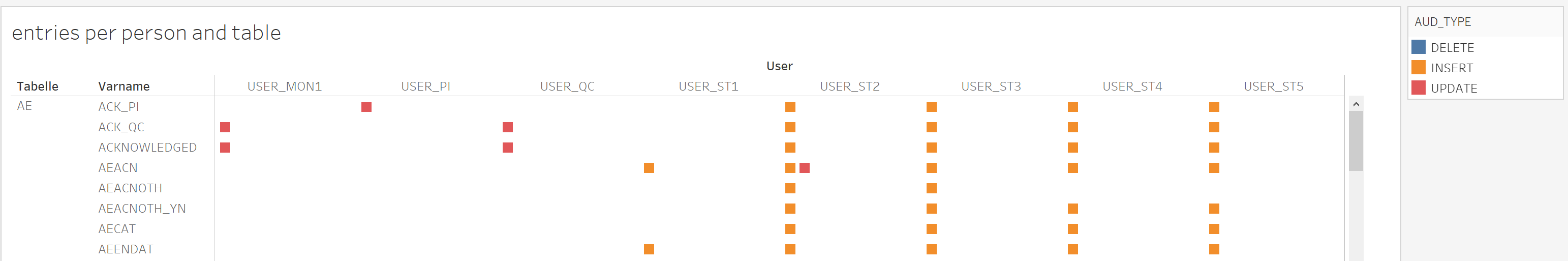
This way we can see that all the monitor PI and QC only updated their respective acknowledge field in the AE table while the study team users (USER_STx) did the inserts and updates in the other variables.
Conclusion
We are evolving, following guidelines and finding ways to keep our work while giving the patients and sponsors the certainty that we are taking all the necessary measures to minimize the impact of COVID-19 on our clinical trials. We will keep adapting these measures and improving them in order to ensure the safety of our patients and to comply with the sponsors’ need for each specific trial.
While there is no out of the box approach to audit trail review, using the right tools helps you get a deeper understanding of your data. Nevertheless, you need to dive into the data and invest the time to really get to know what has happened and why. Using an approach like the one outlined in this article allows you to quickly identify important data for in-depth review.
Profil owns two clinics (in Neuss and Mainz) which together comprise of 85+ beds for in-house trials. We are in a privileged position to continue carrying out trials without much disruption. We are committed to fulfilling the needs of our clinical trials and contributing to the advancement of diabetes care; in times when these advances are more important than ever.