


How is normality assessed?
As the statistical theory of normally distributed samples is very well developed, parametric tests (e.g. t-test, ANOVA) enjoy great popularity. Estimates and tests are usually robust against deviations from normality for larger sample size. However, the examination whether normal distribution is an appropriate distribution or not is indispensable.
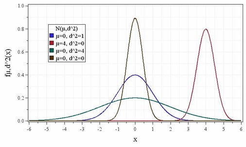
Figure 1: Density function of the normal distribution for different means and variances.
The easiest characteristic of the normal distribution to be tested is its symmetry. If the median is nearly identical to the mean, this could be an indication that the assumption of normality is fulfilled.
As this rough evaluation is far from a sufficient proof of normality, you should use further techniques like graphical methods or tests of normality. These tests have the advantage of being objective, i.e. the hypothesis of normally distributed samples will be tested based on a previously defined significance level. Samples can be tested for a range of distribution using goodness-of-fit tests. In general, this results in a lower power and consequently the goodness-of-fit as a sole test of normality isn’t sufficient. For this reason graphical methods should be used in support of statistical tests as they provide additional information on outliers and size or direction of deviations. Compared to statistical tests the decision whether an empirical distribution is similar to a normal distribution or not is very subjective due to lack of definable limits - normality is in the eye of the beholder.
The evaluation of normality should always be done using graphical methods and test of normality:
(1) Graphical methods: e.g. Q-Q-Plot, Histogram and Boxplot
(2) Test of normality, e.g. Shapiro-Wilk test or Anders-Darling test
In a Q-Q-Plot the quantiles of an empirical distribution are plotted ordered by size versus the corresponding theoretical quantiles of a normal distribution. If the data points are located exactly on a diagonal line the empirical distribution is similar to the theoretical normal distribution. Large deviations of the last data points from the line can be interpreted as outliers.
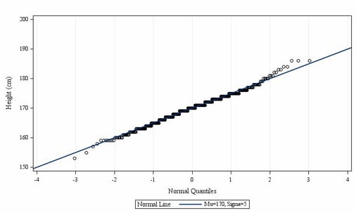
Figure 2: Normal Q-Q-Plot for height
A histogram illustrates the frequency distribution of an analysis variable. For this, the values are grouped into intervals and displayed in the form of a rectangle. The height of the rectangle reflects the frequency density. When you compare the frequency distribution of the sample to the corresponding theoretical density function of the normal distribution you get an impression of how close the empirical distribution is to the normal distribution. For the assumption of normally distributed values to be true, the curve of the rectangle approximately should correspond to the curve of the theoretical density function of the normal distribution.
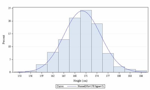
Figure 3: Histogram for height
A boxplot represents several dispersion and location measures of a variable and gives an impression of the distribution of this variable. In general, a boxplot consists of a rectangle (box) and two lines (whiskers). The box corresponds to the area in which 50 percent of the data points are located. The median of the sample is displayed as line within the box and divides it into two halves. The dot within the box characterizes the mean of the sample. The whiskers define the 1.5-fold of the interquartile range. Outliers are represented as circles outside of the whiskers. The location of the median shows whether a distribution is symmetric or skewed. An asymmetrical boxplot or a high number of outliers are indicators of an empirical distribution that doesn’t follow a normal distribution.
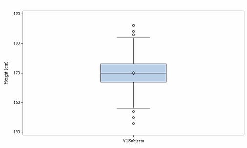
Figure 4: Boxplot for height
Usually the alternative hypothesis is the favored hypothesis, which is controlled by the α-error, i.e. that the α-error should be small. For goodness-of-fit tests the null hypothesis is often the favored hypothesis (e.g. where the assumption of normality should be proved). The acceptance of the null hypothesis the β-error – which should be small - can only be determined if you test against a specific alternative hypothesis. This can‘t be defined for some goodness-of-fit tests (e.g. Kolmogoroff-Smirnov test) and results in a lower power, which only can be increased by a high α-error. A high power (or rather a low β-error) is important to have a minor risk to accept the hypothesis of normality, although the sample isn’t normally distributed.
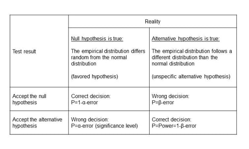
Figure 5: Assessing normality using Goodness of fit tests: P=Probapility
Therefore you should prefer to test with high power, e.g. Shapiro-Wilk test or Anderson-Darling test.
Statistics in clinical trials
Looking at the above it becomes clear that even seemingly simple things like determining if you are dealing with normally distributed samples should be done with care and by an expert. Always trust your statistical analysis to be done by statisticians as are available in good full-service CRO's like Profil Germany. We have a dedicated team who take care of our clients' statistic analyses.